
Essay
Northline Editions / 2026
Designing for Attention That Isn't There
Most design briefs still imagine a reader who no longer exists. A look at designing honestly for divided attention. The essay looks at what honest design looks like instead.

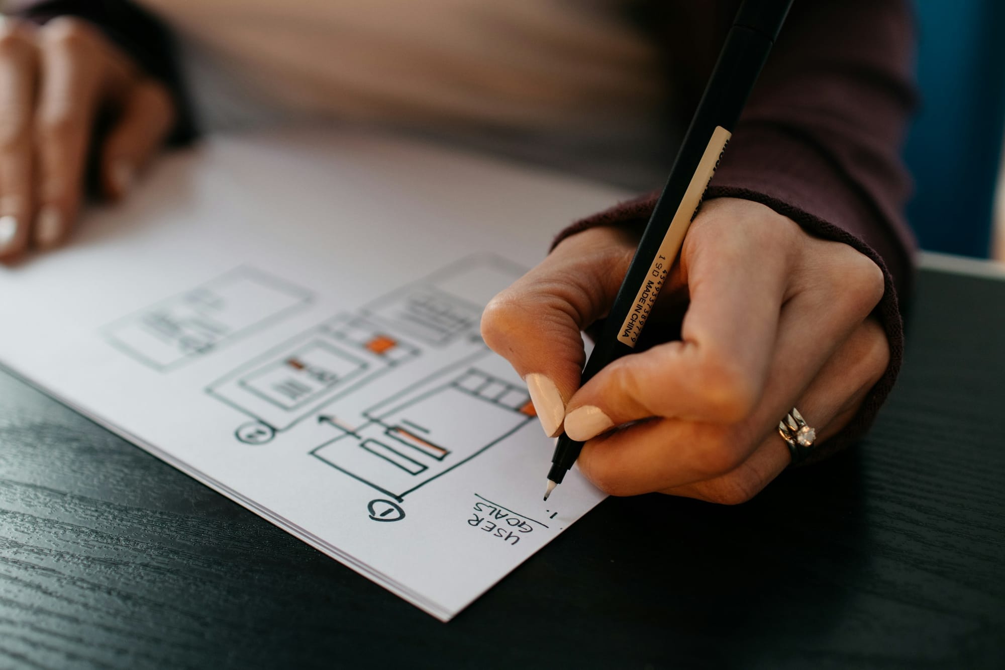
Most design briefs still describe attention as if it were waiting patiently to be arranged. There is a reader, the brief implies, sitting at the right distance from the page with enough time to understand its hierarchy, notice its details and follow the sequence the designer has prepared. The reader may be busy, but not yet distracted. They have arrived.
That reader is useful in a studio because a design needs somebody imagined at the other end of it. The trouble begins when the imagined person becomes more considerate than the real one. Actual readers open an article between messages, glance at a headline while standing in a queue, lose their place when a notification covers the sentence and return later through a different device. They are not careless. They are moving through an environment built to interrupt them.
Design cannot restore the quiet that environment has removed. It can, however, stop pretending the quiet is still there.
The attentive reader was always partly fictional
There is a tendency to treat divided attention as a recent decline, usually blamed on phones and spoken about with the tone reserved for damaged public infrastructure. Digital interfaces certainly intensified it, but the perfectly attentive reader was never a reliable design material. Printed newspapers were folded on trains. Catalogues sat beside ringing telephones. Magazines were read in kitchens, waiting rooms and beds, interrupted by ordinary life long before a screen learned how to vibrate.
What has changed is not the existence of interruption but its frequency, and the precision with which it can now pursue a reader. The contemporary page often shares its physical surface with the thing interrupting it. A notification does not merely call from another room; it occupies the same rectangle as the paragraph. Even when nothing appears, the possibility of interruption remains visible in the tabs, badges and controls gathered around the content.
Designers sometimes answer this by increasing intensity. The headline gets larger, the colour brighter, the animation harder to ignore. This may win a moment of attention, but it joins the competition that caused the problem. A page designed to shout above every other page helps create the exact environment in which quiet reading becomes difficult.
Attention is not a prize the loudest element deserves. It is a condition a page can either support or exhaust.
The more useful response is structural rather than theatrical. If attention may arrive in fragments, the page needs to remain intelligible in fragments. That does not mean reducing every idea to a list or treating readers as incapable of sustained thought. It means providing clear places to enter, pause and return without requiring the reader to reconstruct the design each time.
Designing a route back in
A page that supports interrupted reading has a strong sense of location. Its headings say something rather than merely decorating a transition. Paragraphs are shaped around one movement of thought instead of stretching until the argument disappears inside them. Captions provide context without demanding that the reader remember a reference from several screens earlier. Links describe where they lead. None of these decisions is novel, which is partly why they are easy to neglect.
The practical test is not whether somebody can scan the page quickly. Scanning is only one mode of reading, and designing exclusively for it produces pages that feel like collections of exits. The better question is whether a reader who stops halfway through can recognise where they were when they return. Continuity matters as much as immediacy.
Before calling a page finished, I find it useful to make a short interruption pass:
- Read only the headline, standfirst and section headings. Do they describe an honest outline of the piece?
- Leave the page halfway through and return after doing something else. Is the previous position easy to recover?
- View it at the narrowest supported width. Does the hierarchy survive without relying on scale alone?
- Remove decorative motion temporarily. Does the page still communicate what deserves attention first?
- Check every caption, label and link outside the context in which it was written. Does it still make sense?
This kind of review is humbling because it exposes how often a design depends on the reader remembering the designer's intention. A pale rule may have seemed like enough to mark a new section when the layout was assembled in one continuous session. After an interruption, it may be almost invisible. A clever sequence of image crops may feel obvious to the person who selected them and arbitrary to someone seeing only the third image on a small screen.
The answer is not to explain everything twice. It is to make relationships visible through repeatable form: consistent spacing before sections, stable caption placement, predictable controls and a hierarchy that does not invent a new grammar halfway down the page. Repetition, used well, is a form of hospitality.
Attention is not the same as speed
Designing for limited attention is easily confused with making everything shorter. That is the logic of the summary card, the shortened label and the paragraph reduced until it fits without scrolling. Sometimes brevity is appropriate. Sometimes it removes the very texture that made a piece worth reading.
Long work can respect divided attention when its structure gives the reader confidence. A book uses chapters, running heads and page numbers not because its ideas are simple, but because the object understands that reading will happen across time. Editorial interfaces need equivalent signals: meaningful sections, visible progress, durable links and typography comfortable enough that returning does not feel like work.
The distinction matters because speed is a property of the transaction while attention is a relationship. A page can be fast to load and fast to scan while remaining difficult to inhabit. It can also ask for twenty quiet minutes and make those minutes feel protected. The design does not control whether the reader grants them, but it can show that they will not be wasted.
This requires a certain restraint from the people making the page. Not every feature needs to announce itself at once. Not every secondary action deserves equal weight. Empty space is allowed to separate one demand from another. The result may look less competitive in a screenshot, because screenshots reward simultaneous impact. Reading happens in sequence.
The absent attentive reader is not a reason to lower the ambition of editorial design. It is a reason to locate that ambition more honestly. Our job is not to manufacture concentration through force. It is to remove avoidable friction, make orientation easy and leave enough quiet around the work that attention, whenever it arrives, has somewhere to stay.