
Essay
Northline Editions / 2026
In Defense of Boring Layouts
Predictable layouts are unfashionable and, quietly, correct — a short defense of structure over spectacle in editorial design.

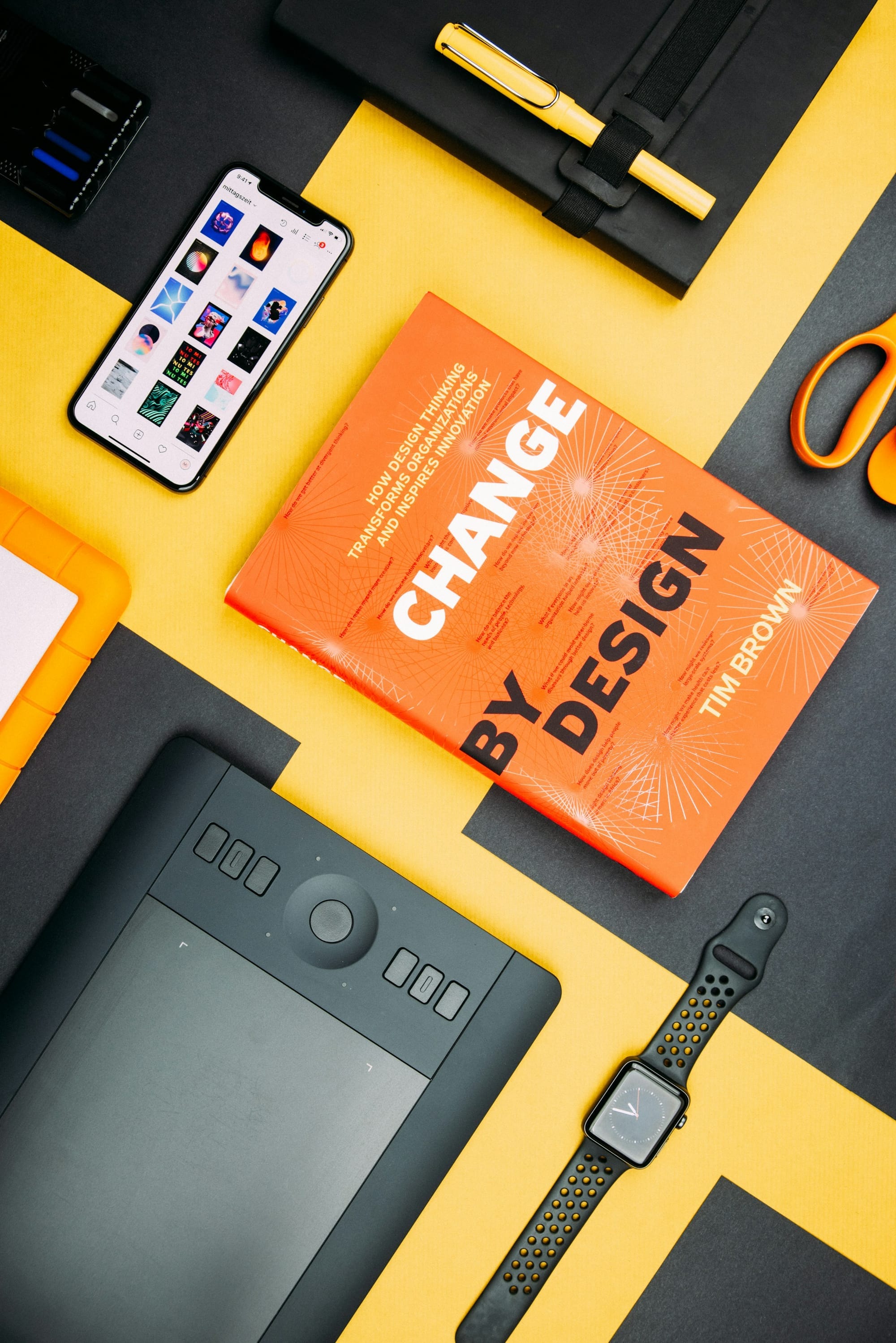
Every few years, editorial design rediscovers the grid-breaking spread — text wrapped around diagonal images, headlines set at odd angles, columns that refuse to line up. It photographs beautifully in a portfolio and reads terribly on a page. This isn't a coincidence. The two things a layout has to do well, hold attention and let someone read, pull in different directions more often than design culture likes to admit.
I've sat on both sides of this argument in the same meeting more times than I'd like to admit — pushing for restraint on one project, quietly wishing for more visual daring on another. The pull toward the unconventional layout never fully goes away, and it shouldn't. What changes with experience isn't the impulse itself but the ability to recognise, fairly quickly, whether a given piece of content is one of the rare cases that genuinely benefits from it.
The appeal of the unusual layout
A striking layout earns attention quickly, which is exactly why it is so tempting to reach for. In a portfolio review, in a pitch deck, in the two seconds someone spends scrolling past a page before deciding whether to stop, an unusual composition does real work that a conventional one cannot. This is not a shallow instinct. Attention is genuinely scarce, and a layout that fails to earn any of it has failed regardless of how well the underlying content might have read.
The problem is that the same qualities that earn attention in a two-second glance often become friction the moment someone starts reading. A diagonal text wrap that looked bold in a thumbnail forces the eye to hunt for the next line. A headline set at an angle, striking as a single image, becomes tiring the third time a reader has to tilt their head to parse it. The layout wins the glance and loses the read, and a publication's actual job is mostly the second one.
This trade-off rarely shows up in the room where the layout gets approved, because that room is almost always judging the layout the way a portfolio reviewer would — as a single striking image, evaluated in isolation, rather than as an environment someone has to inhabit for several paragraphs. A stakeholder looking at one spread on a screen has no way to feel the fatigue that accumulates across an entire feature built the same way. By the time that fatigue becomes visible, in the form of readers abandoning articles partway through, it is very difficult to trace the cause back to a specific layout decision made months earlier.
What boring layouts are quietly doing
A conventional grid — clear columns, consistent margins, a predictable relationship between headline and body — looks unremarkable precisely because it has already solved a long list of problems that a novel layout has to solve again from scratch. Line length calibrated to a comfortable reading measure. Consistent vertical rhythm that lets the eye track down a page without recalibrating at every section. A clear, repeatable hierarchy that a reader learns once and can then rely on for the rest of the publication.
None of that is boring in the sense of being lazy. It is boring in the way a well-engineered bridge is boring: unremarkable specifically because it isn't fighting the forces acting on it. A layout that fights against how eyes move across a page will always cost something in comprehension, no matter how compelling it looks as a static image. The cost is just harder to notice than the visual appeal, because it shows up as a slightly higher rate of readers giving up partway through rather than as anything a stakeholder can point to directly.
The engineering comparison holds up better than it might first seem. Nobody praises a bridge for being unpredictable to drive across, and the standards that make a bridge safe were mostly worked out through decades of failures nobody wanted to repeat. Editorial grids carry a similar accumulated history — line lengths, margins and hierarchies refined over generations of publications learning, issue by issue, what actually kept readers reading. Discarding that history to look distinctive is not neutral. It's choosing to relearn, on your own readers, lessons the industry already paid for.
There is a version of this argument that goes too far, treating every departure from the standard grid as a mistake, and that isn't right either. Some content genuinely benefits from an unconventional structure — a visual essay whose whole point is the relationship between images, a data story where the layout is itself part of the argument. The distinction that matters is whether the unconventional choice serves the specific content in front of it, or whether it exists mainly to look distinctive in a portfolio. The first is a legitimate creative decision. The second is a designer optimising for the wrong audience — the review panel rather than the reader who has to spend ten minutes with the thing.
Most editorial content, most of the time, is better served by the boring choice. That isn't a failure of ambition. It's a recognition that the layout's job is to disappear in service of what it's carrying, and the layouts that do that job best are, almost by definition, the ones nobody remembers noticing — which is a difficult thing to feel proud of in a portfolio, and precisely why the temptation to reach for something louder never fully goes away.