
Essay
Northline Editions / 2026
Why Good Typography Still Depends on Someone Slowing Down to Look Closely
Typography rewards attention more than talent, and good type decisions still depend on someone slowing down to look closely.

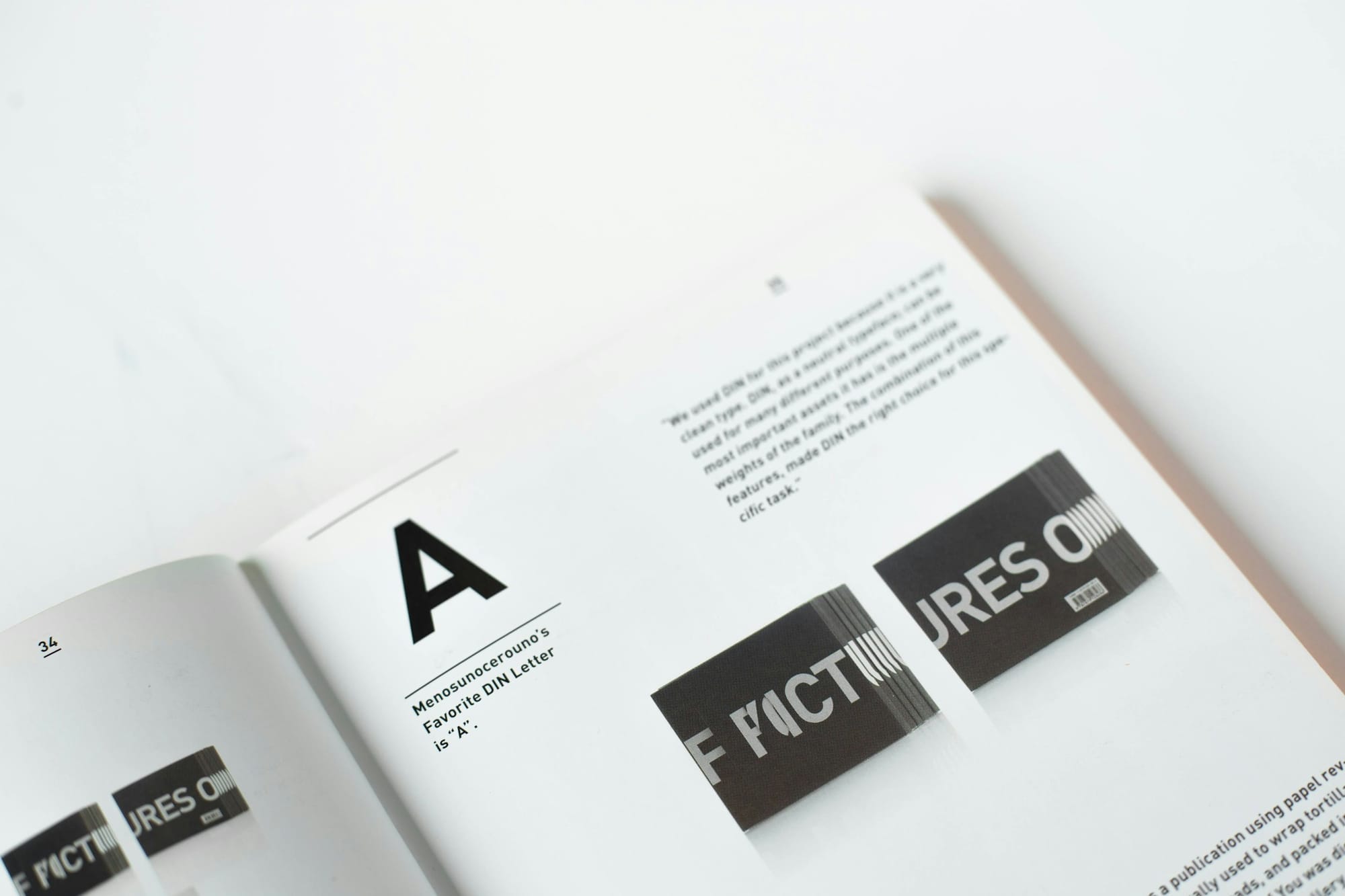
Type is the part of a design that people read without ever intending to look at it, which is exactly why it rewards a slower kind of attention than most other design decisions get. A colour choice announces itself. A layout invites comparison at a glance. Typography does its work quietly, at the scale of individual letters, and most of what makes it succeed or fail happens well below the resolution most people are looking at.
I think about this every time a client asks, mid-project, why a particular revision is taking longer than the others on the schedule. The honest answer is often that the type is finally getting the attention it needed from the start, and that attention doesn't compress well. A layout can be roughed in quickly and refined later. Typography resists that sequence, because the small adjustments that make it work — tracking, line height, the exact relationship between a caption and the image it sits under — tend to reveal themselves only once everything else around them has stopped moving.
What attention buys
Ask a design student what makes typography good and the answer usually reaches for a typeface name — something confident-sounding, something with a story attached. Ask a working typographer the same question, ten years in, and the answer is duller and more useful: it depends on spacing, on line length, on the specific relationship between a heading and the paragraph beneath it. None of that is glamorous. All of it is where the actual difference lives.